Designing custom woven labels for your new clothing brand is an important step in creating a professional and cohesive image for your brand. However, it can also be easy to make mistakes that can negatively impact the effectiveness of your labels. In this article, we will discuss some design do’s and don’ts to help you avoid common mistakes when creating custom woven labels for your clothing brand.

Do’s
- Keep it simple: One of the most important things to keep in mind when designing custom woven labels is to keep them simple. Avoid using too many different colors or fonts, as this can make your labels appear cluttered and unprofessional. Stick to a simple color scheme and font that is easy to read and represents your brand well.
- Use high-quality images: If you plan to include images on your custom woven labels, make sure to use high-quality images that are clear and easy to read. Low-quality images can make your labels appear cheap and unprofessional.
- Pay attention to the details: When designing custom woven labels, it’s important to pay attention to the details. Make sure that your labels are properly aligned, that the text is centered, and that there are no typos or spelling errors. These small details can make a big difference in the overall appearance of your labels.
- Consider the size and shape: The size and shape of your custom woven labels can also play a big role in their effectiveness. Make sure to choose a size and shape that is appropriate for your clothing items and that will be easy to read.
- Use a good quality thread: Woven labels are made by weaving threads together to create an image, it’s important to use good quality thread that is durable and long-lasting.


Don’ts
- Don’t use too many colors: As mentioned earlier, it’s important to keep your custom woven labels simple. Using too many different colors can make your labels appear cluttered and unprofessional. Stick to a simple color scheme that represents your brand well.
- Don’t use hard-to-read fonts: When designing custom woven labels, it’s important to choose a font that is easy to read. Avoid using fancy or hard-to-read fonts, as this can make your labels difficult to read and understand.
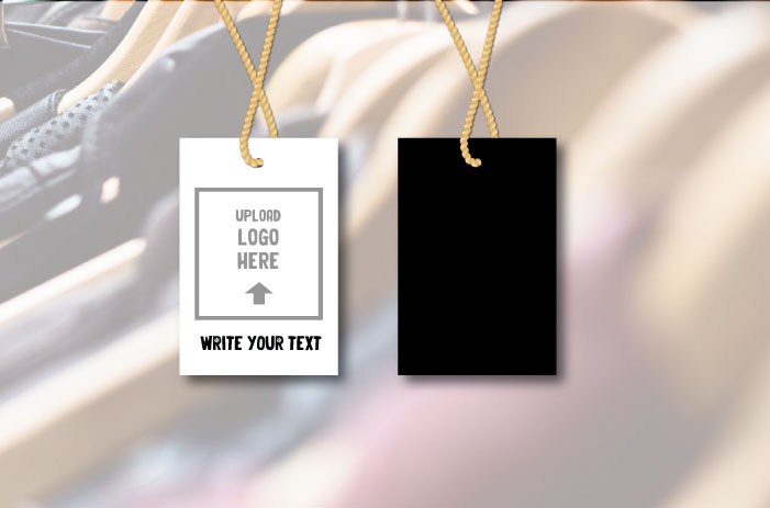
- Don’t neglect the back of the label: Many people make the mistake of only focusing on the front of their custom woven labels and neglecting the back. However, the back of your labels is just as important as the front, and should be designed with care.
- Don’t copy other brands: It’s important to create a unique image for your brand. Avoid copying other brands or using images or designs that are similar to those used by other companies.
- Don’t skimp on the quality of the label: Creating custom woven labels is an investment, it’s important to use a reputable and experienced label manufacturer that use high-quality materials and advanced manufacturing techniques to produce durable and long-lasting labels.

In conclusion, designing custom woven labels for your new clothing brand is an important step in creating a professional and cohesive image for your brand. By following the do’s and don’ts discussed in this article, you can avoid common mistakes and create labels that effectively represent your brand and stand out from the competition. Remember, custom woven labels are the first thing a customer will see, so it’s important to make sure that they are of high quality and that they are designed to make a good first impression.